

If you are an avid Alectio follower, you’ll know by now that efficient training is what we do. It is not just a matter of philosophy (even though it is, as we have described here, here and here); it’s also a simple matter of economics. For many companies in a wide range of different fields, in fact, jumping to conclusions that poorly-performing datasets require more training data might lead to the death of their business. Autonomous vehicle companies, for instance, could easily waste the totality of their operational budgets on nothing else but data labeling if they were not careful, and are often led to a conundrum: risk their financial well-being to annotate the maximum of data to build high-performance models, or manage their budgets properly, and lose to the competition. For others though – like in Healthcare, BioTech or Energy -, there just aren’t enough experts on the market. That’s the bucket that the aviation industry falls into.
Take the Dashlink flight dataset, for example. For people familiar with the space, it is a fairly well-known dataset of flight data broken down into different flight phases. For us, it is an opportunity to try out our technology and experiment with new techniques to prove that oftentimes, more data just isn’t the answer – and without disclosing too much just yet, we can already say that we’ve been pretty successful here.
We have experimented with unsupervised learning techniques to better understand the anomalies within the dataset. After identifying a relevant unsupervised learning task, we have tried to conclude the value (or absence thereof) of using additional flight data. We conclude this post by showing that more data isn’t better (is that a surprise?) and make a case for the generalizability of our approach.
The Dataset
The Dashlink flight dataset consists of airplane data from 35 airplanes; each one of those batches is called a tail. It is basically the data that pilots analyze in real time when they are flying, and that gets recorded on a plane’s black box.
Each tail consists of frames (basically a timestamp), and each frame consists of 186 features. Furthermore, for each feature we have the following data structure:
- sensor recordings
- sampling rate
- units
- feature description
- feature ID
The sensor recordings are those generated by a particular sensor for that time period. The sampling rate is just how often the sensor was used within that period. A description, ID, and relevant units are also provided for the user’s information. For our task, we compress the dataset into a 2D numpy array so it ends up looking like this for one entry. Printed also is the total squeezed dataset:
[ 0.000e+00 1.000e+02 3.562e+01 3.000e+02 -2.400e-01 -4.001e-02
1.000e+00 1.000e+00 2.547e+01 2.503e+01 2.447e+01 2.550e+01
9.275e+01 1.997e+01 4.300e+01 2.000e+03 -1.070e+02 0.000e+00
-8.000e+01 3.600e+01 3.744e+03 6.299e-01 1.530e+02 1.475e+02
1.529e+02 1.000e+00];
Shape: (105986, 186)
For more information about the meaning of each one of the features, please refer to the FAQ section of the dataset.
Our Work
In our case, since we are ML people, we are considering this dataset to make predictions; here, we want to see if we can predict the phase of the flight from the sensor data, and in particular, how much data is needed to train a model to make such a prediction. As we mentioned earlier, collecting a lot of data is easy and tempting in order to build a better model, but annotating it properly would require expert pilots, which are hard to find because there is a growing shortage of pilots on the market (though COVID-19 has changed things a bit recently).
Our study will be broken down into the following steps:
Data Compression: The dataset is first preprocessed and then passed through an encoder to generate normalized embeddings. A decoder is used to decompress the dataset.
Clustering: We use K-Means clustering on the generated embeddings to cluster the dataset into two parts: standard frames and anomalous frames.
Anomaly Detection & Visualization: We visualize the embeddings using T-SNE and then color them using the cluster they are assigned to. T-SNE is a method to visualize vectors in high dimensional spaces such that each vector’s nearest neighbors are preserved. A good resource to get started with T-SNE can be found here link.
Data Preprocessing: Calibration
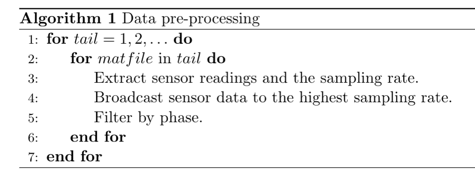
Naturally, given that our goal is to reduce the size of the training dataset while getting the best model performance possible, it is key for us to achieve the minimum loss of information during the preprocessing period (ideally, we want a completely lossless process!).
The essence of the algorithm is that we extract sensor readings and broadcast the data so as to not lose any information. We then filter by phase. The dataset offers us 8 phases: Unknown, Preflight, Taxi, Takeoff, Climb, Cruise, Approach, and Rollout. The reason we filter by phase is that we can only understand anomalies within certain pilot actions and this would not generalize across different flight modes. In other terms, some phases are more error-prone, either because of human error or problems with a specific type of sensor.
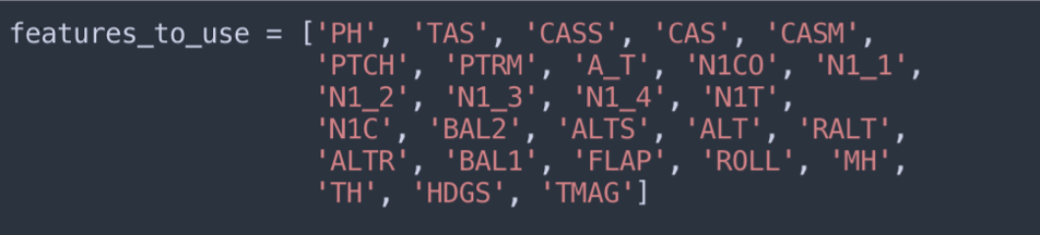
Data Preprocessing: Feature Selection
We restrict ourselves to using features related to airspeed, pitch, thrust, altitude, the state of the landing gear, flap settings, roll angle, and heading. These are the most informative features and capture the most information. For the experiments below, we restrict ourselves to the rollout phase.
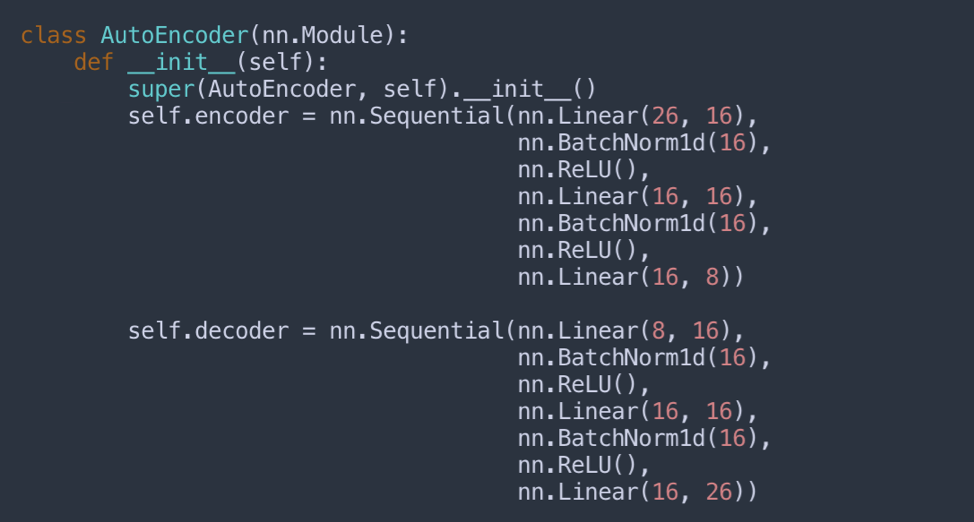
Data Compression: Auto-Encoder
Below is the architecture for the simple auto-encoder we’re using. It takes the 26 features above as input.
Below, we show how the auto-encoder performs on an independent, unseen flight tail across its training process.
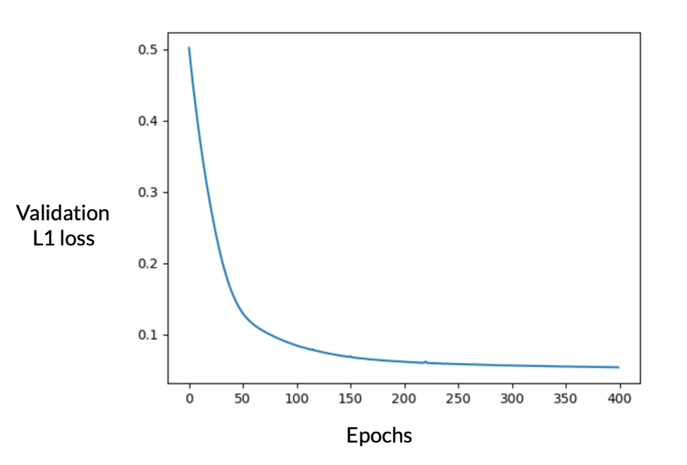
As we can see, the auto-encoder performs really well in compressing the data. The next step is to visualize these embeddings and see where they reside relatively to each other. In the plot below, we are displaying the K-means clusters associated to the embeddings.
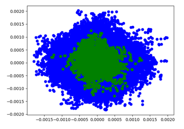
While the cluster map above may not show it, the number of green points are only 4050 in number. The number of blue points, in comparison, is 1,252,050 (!).
This strongly suggests that the green points are anomalies.
Data Selection: Variable number of tails
Now is time for us to see how good our predictions can be if we operate with a smaller dataset. For that purpose, we create four random subsets of the entire dataset:
- Subset 1: 20 tails
- Subset 2: 10 tails
- Subset 3: 5 tails
- Subset 4: 1 tail
For each subset, we train a separate auto-encoder and use the test embeddings to cluster and visualize. The test set (15 tails) is constant across all experiments. The cluster labels assigned using the model trained on Subset 1 is assumed to be ground truth. We compare the labels assigned using models trained on Subset 2, 3, and 4 against the labels obtained with Subset 1.
The point of using a variable number of tails is that it basically illustrates the value of adding more flight tails. If for instance, the pseudo-labels achieved with Subset 1 are very similar to the ones achieved with Subset 4, we can say that we didn’t really gain anything by collecting data for 19 additional tails.
Results: Cluster Maps
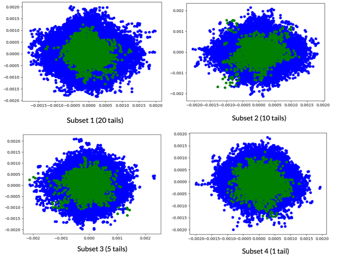
As can be seen in the above images, the cluster maps look almost identical to the naked eye. Hence, the idea of using less data passes the nearest neighbor embedding test.
But what about the performance of our clustering approach? Is it at par with the auto-encoder trained using the large dataset?
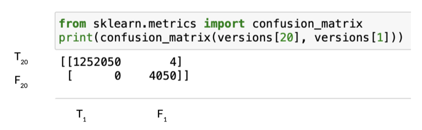
The above confusion matrix shows that using just one tail instead of 20, leads to a discrepancies of only 4 predictions out of 1,256,100 test labels. With such a result, it is certainly reasonable to say that training an auto-encoder on the entire dataset is overkill. That’s great news because it means that our approach can alleviate the shortage of experts capable of annotating such unique datasets; that results in faster development cycles and huge cost savings for the countless companies who can’t afford to annotate their entire datasets.
The best part: this post only covers a small portion of the entire Alectio technology (the pre-filtering part), and in practice, we could reach even higher compression ratios and higher model performance.
Conclusion
We demonstrated that using only one flight tail data instead of twenty yields the same anomalies on an unseen dataset consisting of 15 tails. Our future work will focus on more unsupervised learning tasks to show that we don’t need to collect large amounts of data in order to train good generative models.
Some of the upcoming tasks include:
Image-Inpainting / Colorizing: Image inpainting refers to the correction of corrupted images by passing the defective image through a generative model. Colorizing would change it from Black & White to a high resolution color image as demonstrated here.
Synthetic Image Generation: Generation of synthetic training data and unseen images is particularly useful when the dataset is small. A good demonstration of using GANs for face generation can be seen here.
NB: The Alectio team would like to thank Mikhail Klassen, CEO of Paladin AI, for pointing us to this very interesting dataset and for his precious insights on the type of data!


0 Comments