
The blueprints for the first machine that could vaguely be called a computer were created by Charles Babbage in the 1830s. It was called the Difference Engine. The plans called for a monstrous, steam punk contraption, a collection of gears that had to be physically cranked and manipulated to do any calculations, and though Babbage built a “beautiful fragment” of the Difference Engine to prove its efficacy and delight his friends, the machine was never actually built.
Nevertheless, the blueprints for it (and his more robust Analytics Engine) are considered by most to be the first computers ever invented.

We mention this not to refresh your memory about the History of Computers class you took a while back but to highlight a quote from Babbage’s autobiography:
On two occasions I have been asked, “Pray, Mr. Babbage, if you put into the machine wrong figures, will the right answers come out?” … I am not able rightly to apprehend the kind of confusion of ideas that could provoke such a question.
You may know this more idiomatically as “garbage in, garbage out.”
Now, in the context of machine learning, most of us understand that bad data produces bad results. A bunch of mislabeled images are likely going to create an image recognition algorithm that’s confused or wrong more often than it is right. That much is essentially gospel.
But there’s far more nuance than just bad data or good data. Data exists on a spectrum. Not all of it is created equal. In this post, we’re going to look not at data quality but data usefulness and how to use active learning to listen to your models and understand what sort of data they need to improve their performance.
Let’s start by introducing our dataset: the Letter Recognition Dataset from the always useful UCI ML Repository. It’s a 20,000 row dataset containing single capital letters with a full 17 unique attributes for each letter. It’s also worth noting that this is a tabular dataset and not an image dataset–each row contains normalized values that were extracted from image data. If you’re interested in learning more, the UCI link above has a detailed description of what we’re working with for this experiment.

What we’re going to look at briefly today is how we can use active learning to understand how your model changes its preferences over time and what that means for your machine learning projects. And we’ll be using that UCI dataset to do it.
We started with a random sample of labeled data to train our model (which, in this case, is a random forest classifier from sklearn with no settings changed). You can see that in “loop 0” in the graph below. After that loop, we used an entropy-based querying strategy to select additional data to label for the next loop. Put plainly, first our model learned on a certain selection of randomly sampled, labeled data. Then, we applied those learnings to our “unlabeled” data. The unlabeled data it was particularly uncertain about was then “labeled” before the next loop. (Admittedly, “uncertainty” is a bit rudimentary for the approach we take at Alectio, but the fundamental concept is similar).
Overall, we went through a total of 10 loops. From that, what we hoped to diagnose is how our model’s preferences changed over time. What classes (in this case, letters) did our model want less of? What classes was it greedy for? What features of a class does the model prefer, and of those features what range of values is the model interested in? And what can we learn from that?
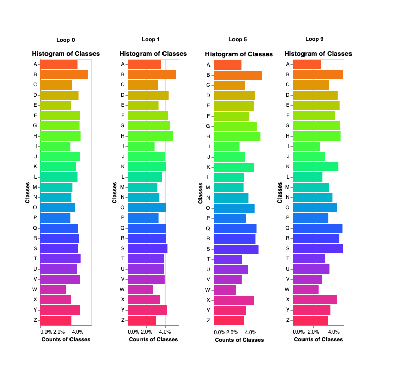
For example, in the graph above, you can see our random sample picked about 4% of the letter “A” to start. But by the time we were through ten loops, our model was requesting far less “A”s to be labeled and thereby learn from. Contrast that with a letter like “S” or “Q.” Those letters had a roughly 4% sample rate to start but by loop ten, were two of the most requested classes. In other words, as our model went on, it wanted less “A”s and more “Q”s.
Why exactly? Essentially, the model was more confident in its “A” predictions than its “Q” predictions. In other words, additional “Q” labels would prove more useful to the model than additional “A” models.
Now, here’s the crux of the thing: in the UCI dataset itself, every class is essentially equally distributed. Meaning there are as many “A”s and there are “Q”s. But the model is asking for more of specific classes because those classes will more dramatically improve its performance — this is what active learning, after all, is about.
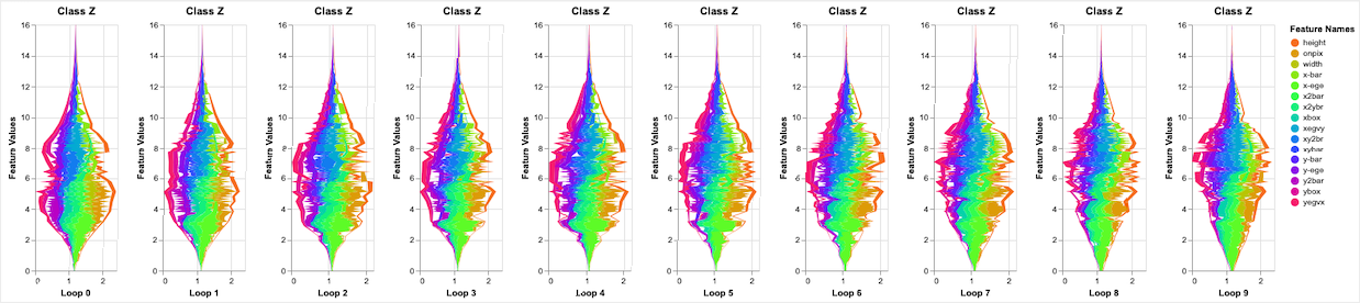
(We found this behavior across features as well, but we’re not going to dig into those 17 specific features here. We bring it up because a really robust querying strategy is looking at those features and weighing the importance of all inputs here. A bit over-complicated for a blog but it’s something we do a lot of research on here at Alectio–in fact, it’s how we help people train good models with less data! If you’re interested, reach out and we can show you how!)
In other words: representativeness does not equal usefulness. You shouldn’t train a model by showing it a representative sample of your data at large. By analyzing your model as it requests labels, you can start to uncover what types of data (and what features) it’s greedy for and which ones it’s more confident about.
Let’s offer a simple example here: say you’re building a binary classifier that looks at an image of a pet and outputs “cat” or “dog.” Cats are a bit more uniform than dogs overall (think about the difference between a St. Bernard and a chihuahua for starters) so your model may start requesting more dog images. It’s not worth your time to worry about whether those requests are representative of the pet population at large or the dataset you’re working with. What’s important to understand is that the model needs to see more labeled dogs so it can be more confident predicting which furry friend it’s looking at. More dogs may not be representative of the data at large but they’re more useful to the model in question.
So what can this do for your data projects? Fundamentally, it teaches you a lot about how your model learns. That’s never bad. But practically, monitoring a model’s preferences over loops lets you save a lot of time and money on labeling and data collection. You can see how its preferences change over time and pivot to provide that model with what it needs. If you’re training an autonomous vehicle model and it keeps requesting labels and features associated with rural roads, you can send your drivers out to collect just that data and have your labeling company provide the annotations that make your model improve most.
So don’t get caught up in representativeness when you’re training your model. That can lead to overfitting, wasted budget, and a whole host of other issues. Instead, monitor your model as it learns and give it the information it needs to get smarter. It’s what we do at Alectio–help people train better models on a fraction of the data–and we’d love to help you get started.


0 Comments